
Seamlessly integrated user-centric design principles to drive engagement and accessibility, fostering increased research participation within the AANHPI communities.
.png)
With just under 5 weeks at to finalize this project, I devised a research plan with defined goals and clear research methods to achieve them:
1. Learn as much as possible about the CARE site
client goals & heuristic evaluation
2. Learn as much as possible about users
user research: surveys & usability testing
3. Analyze research, review client comments, and define recommendations
define the problem
4. Propose design solutions
design: ideate and prototype
Due to time constraints, conducting a comprehensive stakeholder interview with the CARE team wasn't feasible. Nevertheless, I had previously gathered ample feedback from various meetings in the past to assist with identifying concerns and understanding their primary objective.
CARE's goal: To create a simple, and easily accessible website that would allow users to:
1. Learn about CARE
2. Enroll in the CARE registry
3. Explore educational resources available to them
I want our website to feel like a hub for all things CARE.
I find the layout and placement of the "if you don't have an email" phone number announcement weird.
I would like if there was a bit more variety for our site, it doesn't have much of its own "feel" to it.
I want people to feel like our website is a helpful resource to them.
The purpose of the heuristic evaluation was to identify some initial usability issues on the existing CARE site. I utilized Jakob Nielsen's 10 general usability heuristics for user interface design to throughly evaluate the current site. Below are some key issues I discovered.

Header labels on the nav bar are unclear and don't give a good idea of where they will take users.
Information is often not laid out in an organic and logical order.
Navigation bar's dropdown strays from industry norm by linking headers to their own separate pages.
Inconsistent information regarding CARE's status and contact information across different pages of the site.
The first hero image consists mostly of plain black and white text, creating a dull initial impression for users.
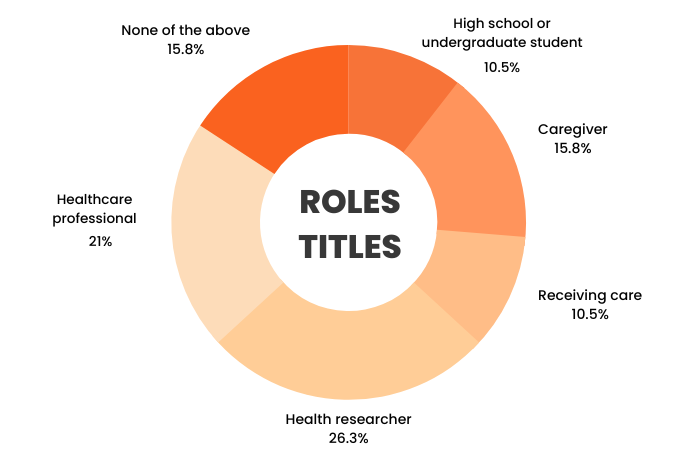
I sent out a survey using Qualtrics through internal CARE staff communication channels and a small select community email list. A total of 14 users participated in the survey. Here is a summary of the average users' characteristics:


Common challenges that users often encounter on websites include:

Key aspects that users consider important for websites to include are:
Limitation:
As this project was academic in nature, I did not have access to the complete CARE user database. Because of this constraint, along with limited time, obtaining a substantial sample size was not feasible, potentially affecting the validity of the survey results.
User personas were created to represent the four user groups identified through the user research. Below is a summary of each personas' goals and pain points. Click each card to see the full persona details.
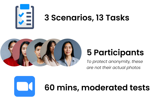
3 distinct scenarios, with 13 tasks total, were created for usability testing based on Rick, Olivia, and Alex's user stories. Here are the test goals:

Limitation:
Due to time constraints, we couldn't create specific usability testing materials for Carrie. Instead, we prioritized testing with the other three personas, as their goals and pain points closely aligned with Carrie's, allowing us to effectively address all their needs.
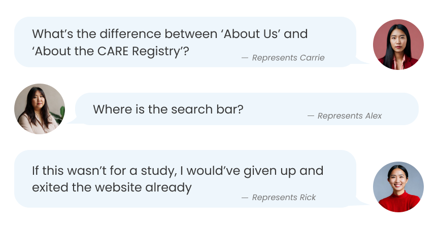
Results validate the need to address the usability issues discovered during my initial user research as all participants encountered multiple issues during testing. Below are some key insights.


When users initially attempt to switch languages, the page content doesn't update until they click on the logo to refresh the page.
Users reported videos and images being overly large, making them a bothersome distraction rather than a helpful addition.
Users found it time-consuming and inefficient to sift through PDFs or watch videos to access important information.
Users often found the information overwhelming and challenging to scan quickly.
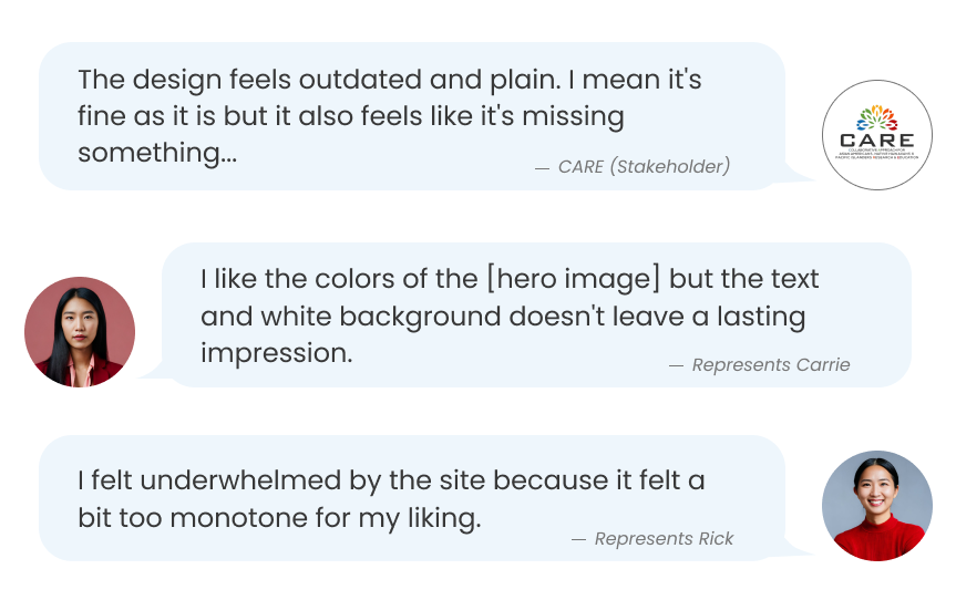
Users expressed dissatisfaction with the site's overall UI/design, describing it as overly plain and lacking distinctive elements.
Users need a clear, intuitive, and engaging user interface that organizes information effectively so that they can navigate the CARE website with ease and efficiency.
For easier ideation, I created a compiled list of requirements drawn directly from the research to help guide the redesign process by allowing me to visualize and prioritize necessary fixes. Drawing from the research findings, CARE's redesigned site should:
To maintain brand consistency, I pulled the color palette directly from CARE's logo. However, I made the deliberate decision to exclude their yellow shade to enhance overall design accessibility, as yellow can potentially pose readability challenges. I chose modern, simple, and variable sans-serif fonts that are easy to read on all screens, and kept layouts consistent by using a 12-column grid.
.png)
I created initial high-fidelity mockups on Figma of the six main pages with the aim to gather some quick feedback before proceeding further.


I received minor feedback, primarily related to content layout, from peers, CARE staff, and the original usability test participants. I iterated based on this feedback for the final designs. The following sections highlight key improvements that were made to the original CARE site.
The original UI design was frequently referred to as dull, so I revamped it
Both CARE staff and users have found that the page lacked visual appeal, describing it as too plain, boring, and "sterile" looking. This would result in a lack of interest in engaging with its content.

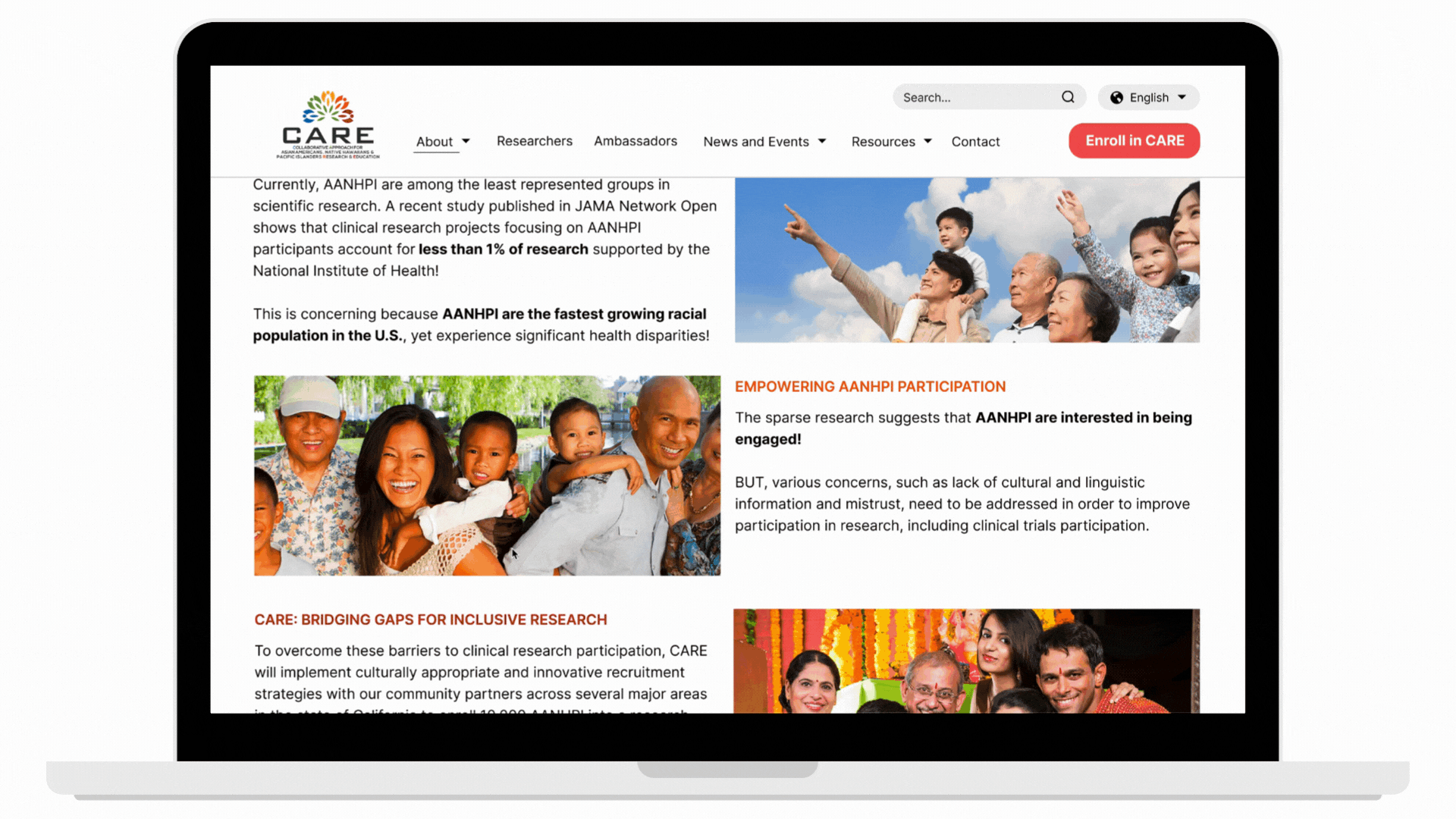
I used the style guide to create a a refreshing, new, and engaging look for the entire site.

Users were almost always overwhelmed by the site's content, so I restructured the layout to ease those feelings
Oftentimes, there would be portions of the original site where the entire screen was just pure text. This left users feeling overwhelmed and discouraged them from actually reading or interacting with the content.

Yet, having a clear and organized layout was reported as the most important aspect of a website for users. This was a clear sign that this was a top priority issue.

I introduced visual variety by incorporating colors, relevant images, bold font choices, and organized the text into more digestible sections using different column arrangements and cards, resulting in a visually engaging appearance that's easy to scan and fosters user engagement.

Users frequently had trouble with the navigation bar
Users would often be unsure about the location of specific information within the website. In fact, the average task time to find the FAQ section was 101.84 seconds.

I reviewed the content on each page and revamped the navigation bar with more coherent headers, resulting in a more structured hierarchy of information.

Users frequently felt like the site's content wasn't easily accessible
A significant portion of the original site content was hidden away and embedded within numerous videos and PDF files, forcing users to either watch the entire video or navigate lengthy PDFs. This left users feeling frustrated and compelled to just skip the content all together.
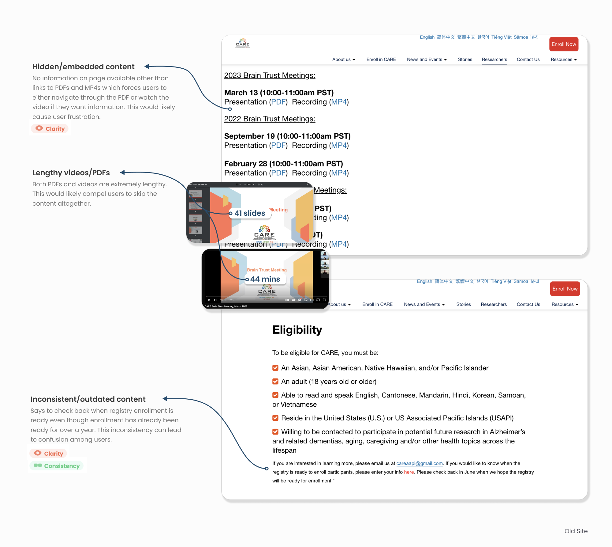
None of the test participants were happy with having to navigate through lengthy PDFs or videos to access the desired information; many preferred skipping the content altogether.

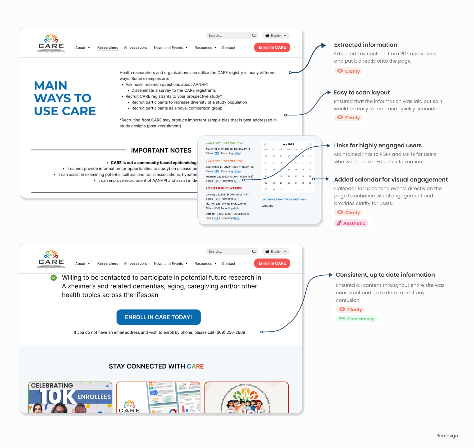
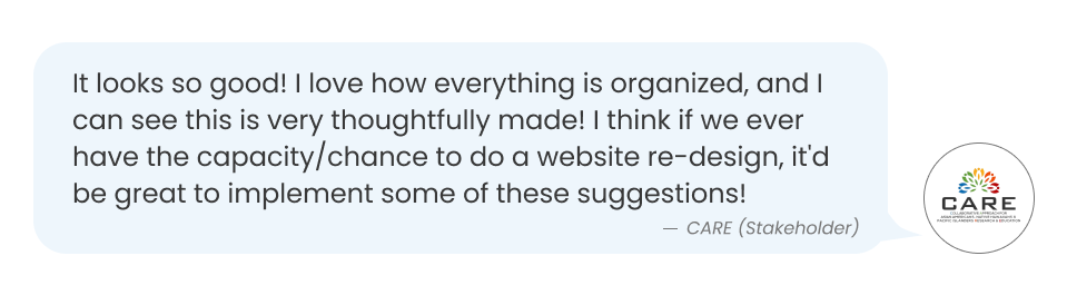
The redesigned site offers a more visually captivating design, improves readability, simplifies navigation, and provides clearer and more accessible content for users.
In order to further improve the user experience on CARE, I suggest a few next steps:
It is important to acknowledge that our limited sample size of user participants may not accurately reflect all CARE users. Consequently, the insights derived from this research may not be entirely representative of the thoughts of all users, potentially impacting the redesign's capacity to adequately address usability concerns for the entire user base.
Reflecting back on this project, here are a few of my key takeaways and lessons learned:
While my ideal approach would've been to conduct iterative usability testing across a range of wireframe/prototype fidelity levels to continuously integrate user feedback throughout the design process, the project had constraints that forced me to adopt a more efficient strategy.
This reinforced the importance of making informed assumptions and trade-offs to maintain project progress and adhere to timelines, and served as a reminder that adaptability is key for successful project outcomes.
While the project's primary goal was to address usability issues, it soon became evident that CARE's brand identity on the site was negatively affecting user experiences. By injecting creativity and a more engaging UI design into the site, I not only resolved user complaints but also facilitated the establishment of a more distinct and enticing visual brand identity.
This shows how a brand's visual identity also encompasses the user experience. It serves as a reminder that a brand's identity has the potential to influence user experiences, just as UX/UI design can impact and define the brand's identity.
.png)

